Introduce your drastic UI changes... slowly
/
We are in the middle of a somewhat sudden rebranding exercise. One of the main colours that was used prominently in the previous theme of the website is now being retired as the UI is simplified.
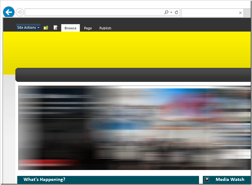
So here is what we have right now:
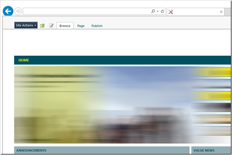
And here is where we're going (currently in development).
Where's the Yellow?
In every case where we ask one of our existing users the first response is always: Where's the "Company Yellow"?
There's of course a marketing message that will go out with our latest release.
But here's the secret developer compromise.
We can reduce the yellow, slowly, overtime
The old header background will remain. But in the Javascript that's run on every page, we introduce a small piece of script that modifies the opacity of the background header.
var days = (new Date("2013-08-20") - new Date()) / (24*60*60*1000); // remaining days until 2013-08-20
var opacity = (days > 0) ? (0.5 * (days / 14)) : 0; // starts from 0.5 opacity to 0
$(".header-banner").css("opacity", opacity);
What this does, is that over the course of two weeks, the yellow's opacity reduces from the original (50% at this next release) to 0%. So as days go on, the yellow header begins to fade, and after two weeks, it will simply disappear!
I wonder what'd be the water cooler conversation. Each person will wonder what happened to the yellow as it slowly faded out of our lives.


